 Having a good website is a must these days.
A recent study by Lightspeed GMI found that more than 93 percent of consumers now conduct online research before making a purchasing decision. So having a good-looking website and online storefront is no longer optional for a small business owner. You need an up-to-date website or you will lose customers and potential sales. But is your website is up to speed? Ask yourself these five questions and it should give you a good idea of whether or not your site could do with a makeover. 1. Does your site have a template or theme that is compatible with mobile viewing? Most modern website themes are responsive, meaning they automatically adjust to fit whatever screen they’re being viewed on. Comscore.com reports that mobile shopping now accounts for over 60 percent of the time consumers spend online, meaning that a website that responds well to mobile devices is no longer optional. The easiest way to assess this is simply to check out how the site looks on your phone. If text looks squeezed together, objects are in the wrong place, or the site is generally hard to use, it might be time to make some changes. Email us, and we’ll make that update for you! 2. Have you done any site reorganization or maintenance in the last year or two? Website design and style is constantly changing. Have you updated your site’s organization in the past couple years? If the answer is no, it probably needs work. Here are a few things to keep in mind when reorganizing and revamping your site.
The last thing you want is potential customers getting the wrong idea about who you are, what you do, or how much it costs to buy your product or service. As I look at small business websites, I am amazed by how often the little details do not add up form page to page. If your pricing is $20 for your basic package on one page, that price should be consistent wherever you mention it. Have you opened new branches without adding them on your site? If so, you are probably missing out on potential business. Take several hours to click through your site and see how up-to-date your information is. If it needs quite a bit of work, it is probably a sign that your site as a whole could use some general upgrades. 4. Are your colors, graphics, or animations cliché or gaudy? American flags waving in the wind and bright neon colors may get your site attention, but not the kind of attention that you want. You are much more likely to be featured on some bad website design list then you are to gain positive press for your business. Animations and gaudy colors should go, immediately. Here are three more things to keep in mind:
The last thing to check out is how your formatting, text, and images look on your site. Everything should look like it is has a place — and is in that place. Here are some things to watch out for:
If all of the above sounds overwhelmingly intimidating to you, don’t worry, contact KrissArt Marketing Design, we will help. Author: Marc Prosser, Contributing Writer Source: http://www.bizjournals.com/bizjournals/how-to/growth-strategies/2016/01/does-your-website-need-a-makeover.html
0 Comments

Website design often becomes an exercise in redundancy and unnecessary complication as you try to build something that stands out from the crowd. After all, people have an overwhelming number of choices available to them when they surf the web. As of last year, there are more than 861 million registered host names and over 180 million active websites, according to Tech Made Easy. Despite that, the best way to build a site that brings visitors back for more is to keep it simple and usable. With that in mind, here are some tips for applying the “keep it simple, stupid” or “KISS” principle of design to your site: Back to BasicsWhen designing a website, it is important to determine what the goal of each page is, and then design each element within the page to reach that goal. If you have a page element or widget that doesn't support the page's objective, it should be removed. On the same note, if a page is unnecessary to your website's overall objective, it too should be removed or changed. To see what changes are necessary, approach your site form the perspective of a visitor and ask yourself what you would stand to gain from visiting each page. If you already have a website and are just updating or redesigning it, take a look at your analytics and see which pages have the lowest traffic, and ask yourself why. Finally, if any product or article on your site takes more than three or four clicks to reach from the homepage, your site has too much depth and its hierarchy must be simplified. More Before the BreakWhen a visitor lands on your site, you only have a few seconds to make an impression and keep the consumer on your page. In fact, a recent Microsoft study found that the average attention span has dipped from 12 seconds in 2000 to 8 seconds in 2013. To grab people's attention and keep it, you need bold headlines and content that immediately addresses your purposes. Additionally, put your most important content where it can be seen right away, so a visitor doesn’t need to scroll down to it or visit another page. A website that does this well is T-Mobile because the company's shop, information, shopping cart, customer service number and product are all displayed prominently above the fold on the landing page. If a visitor has to scroll to see your best content, bring it up to the top and eliminate what comes before it. Fast Loading TimesIt can be tempting to add huge streaming videos, complex HTML 5 and other design elements to your site, but if a visitor leaves before they get to your actual content, your site has failed. Website fads comes and go, and your site shouldn't buckle to trends that increase load times and irritate customers. For example, many sites today integrate a slider that covers the home page, but this actively drives away visitors. Instead, design your landing page to be simple, clear of elements that clutter the screen and rid of features that create long load times.
Do you need help with your website? Contact KrissArt Marketing Design for a free consultation!
Here is our latest work in logo design: 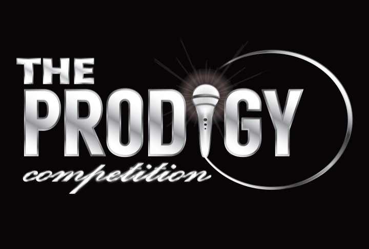 The Prodigy Competition is the ultimate virtual talent contest for gifted young singers.
KrissArt will be working on the online competition website in the upcoming months, if you'd like to learn a bit more about this exciting project, visit their splash page at: www.theprodigycompetition.com Looking for a new logo or website? Contact us today for a quote! We'd love to hear from you.  If your small business doesn’t have a website, you’re inevitably missing out on potential clients and potential cash. Already got a site? Good. Now, let’s talk strategy. Because the quality of that site could also be impacting your bottom line. “Anybody can buy a Web platform and build a down-and-dirty site,” said Buffy McCoy Kelly, partner and creative director of Charlotte, N.C., ad agency Tattoo Projects. “But an (unpolished site) definitely colors the way you look to the world. It colors your value to the consumer. And it can definitely hurt you.” McCoy Kelly and other experts in marketing, advertising and Web design were polled to compile a list of mistakes small-business owners often make when developing and maintaining their websites. Here are their tips, and a handy list of what not to do:
Visual mistakes
Content mistakes
Do you own a small business and need a website? Do you have a website but need updating it? Contact KrissArt Marketing Design for a free consultation. Posted in Small-business, Metro-business on Sunday, April 13, 2014 • www.timesdispatch.com |
AboutOwner, Krissy Carstens, providing the latest news regarding KrissArt's completed projects, Archives
March 2020
Categories
All
|
 RSS Feed