|
There's quite a few rules to stick to when designing a logo. A few examples here is to not mix real images with the design, try to limit the amount of fonts used, if you use more than one, make sure they compliment each other (and try to limit the amounts of fonts to two), and don't outline one word and not the other! Here is the logo when received by the client, and the result from after we fixed it up: 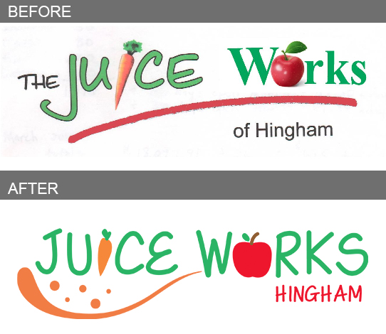 All the elements in the logo clash and don't work well together. As requested by the client, I kept the overall look of the logo the same, but fixed all the mishaps to make it a successful design for the store to proudly display.
Think your logo needs an update or could be better? Contact us for a quote, be sure to send us your logo so we could take a look at it. Besides designing logos, we also offer other services. For example, do you have a logo on file but it's not large enough to print clearly? We could recreate your logo into a high resolution/vector format so you'll have no issues when going to print. Let us know, we're here to help!
0 Comments
Your comment will be posted after it is approved.
Leave a Reply. |
AboutOwner, Krissy Carstens, providing the latest news regarding KrissArt's completed projects, Archives
March 2020
Categories
All
|
 RSS Feed