|
McDonald's golden arches, the Nike swoosh, General Electric's initials — these are three of the most recognizable company logos in the world. But even deep-pocketed corporations like these encounter identity problems. A 2014 study by researchers at UCLA set out to determine how well the general public could identify another widely disseminated corporate logo: Apple. One of the tests is readily available online. Fewer than half of participants — many of whom were iPhone and Macbook owners — selected the correct Apple logo from the multiple choices. Granted, the focus of the study had more to do with recall and recognition confidence, but it reminds us that modifications or even complete overhauls of corporate insignias must be made as necessary to reinforce brand awareness and recognition. Olympic LessonsSports fans remember several great accomplishments from the 2012 London Olympics. U.S. swimmer Michael Phelps won his record 22nd medal, while Jamaica's Usain Bolt proved once and for all he was in fact the fastest man alive. Marketing personnel, however, remember the absolute disaster that became of the logo design for the event. Three of the United Kingdom's largest newspapers bashed the logo, with thousands of readers demanding it be replaced altogether. The jigsaw puzzle-shaped numbers depicting "2012" had some people comparing it to a swastika. The New York Times reported that the logo's flashy colors caused seizures in some epilepsy patients. Several bloggers wrote that the logo looked like Lisa Simpson performing a sex act, while the Iranian government accused London of subliminally spelling the word "Zion" in reference to Israel. Logos need to be simple and leave little for interpretation. At the same time, a logo must convey the company's goals and mission. Think Target and Google. Your logo should not resemble a social media meme that takes several seconds to process. If you decide to use text in a logo, limit it to three words or less containing fewer than 15 letters. Don't overthink the process, as it likely means customers will have to think too much to decipher the logo's meaning. Rebranding RequirementsThe World Wrestling Federation was sued by the World Wide Fund for Nature (the other WWF) in 2002 for violating international agreements pertaining to the use of the initials. A United Kingdom appeals court ruled in favor of the latter, forcing the wrestling WWF to change the logo it had been using since 1982. This could have meant disaster for a video-based firm that was ordered to censor its WWF logo in all past and future productions. But CEO Vince McMahon simply changed the company name to World Wrestling Entertainment (WWE) and launched the clever "Get The F Out" marketing campaign to unveil the new logo. Whether rebranding by force or choice, its important to both adapt your logo to current market conditions, while maintaining and celebrating company history and tradition. Slight tweaks to existing logos are effective in some situations, and KrissArt Marketing Design could help. Assessing Your SituationFrank Goedertier of the Vlerick Gent Management School in Belgium told Forbes that the most important factor to successful branding is a memorable, meaningful and likable logo. But he also warned that a logo should never be changed just for the sake of changing it. PepsiCo learned this the hard way in 2009, when it changed the logo of its Tropicana Orange Juice to "bring it into the 21st century." After being bombarded with complaints from loyal customers, Pepsi promptly reverted back to the old logo. Social media makes it easy to gauge customer attitudes toward your current logo and any potential changes. If your current logo is liked and easily identifies your company, its best to leave it alone. But dead weight, unrepresentative logos should be given the attention necessary to take your company to the next level. Recent Logo Redesign Project
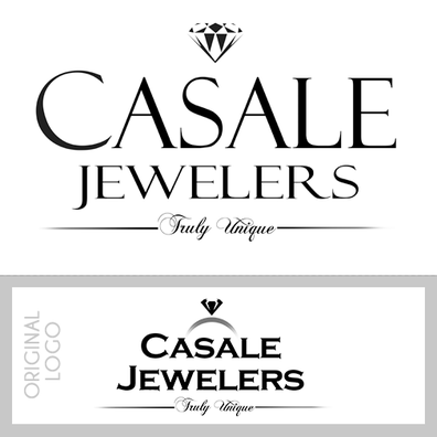
Cory Schifter, owner of Casale Jewelers contacted us asking to make some minor updates to his logo. He didn't want to change his logo completely since it's recognizable but he wanted to feel excited about it again when using it on his marketing material. He felt it needed more of a "modern" touch with more emphasis on "Casale".
Sprucing-up or re-vamping a logo does not necessarily mean a new logo! A skilled design can use any existing logo, tweak some elements, and voilà! Something to now feel excited and proud of your logo again. Think you need a change to your logo? Contact KrissArt Marketing Design today for a quote.
0 Comments
Your comment will be posted after it is approved.
Leave a Reply. |
AboutOwner, Krissy Carstens, providing the latest news regarding KrissArt's completed projects, Archives
March 2020
Categories
All
|


 RSS Feed

